|
I was instructed to use the numerous video clips I was given to make a sophisticated film for this. For this project, I gained knowledge of how to use L and J cuts, captions, sound effects, video effects, freeze frames, and moving text. Learning how to use all these new tools was the difficult part of this assignment; gathering the clips was the simple part. In general, I found that editing videos was more enjoyable than editing audio.
0 Comments
I was given a series of video clips for this assignment that showed males telling jokes to one another. In order to finish the joke and adhere to the 180-degree guideline, which requires two speakers to be on the same side of the camera at all times, I had to mix these clips. Even though I was already aware of this rule and the project wasn't too difficult for me.
For this project, I had to consider a lot of clip syncing in order to provide the impression of multiple views within a single cut. I was given video clips for this project and told to put them together into a small movie. Working with videos required me to trim them down to the appropriate length, which made the process different than working with photographs. Reducing the numerous videos I had into a single, 20-second video was the most challenging aspect of this assignment. Since it was so straightforward, creating the transitions was the simplest part for me. All things considered, I do like using Premier Pro because it allows for more detailed editing than when working with still photographs and because its pretty fun.
What I did differently when working with video clips rather than basic images is that I had to check the timing of each clip and adjust the size if needed, What I found easy was editing all the clips and music, What I found hard this time was finding Royalty Free Video Clips of the same person walking in the rain and finding clips that fit the theme, one more thing that was hard to find was a royalty free music to fit in this video, My overall thoughts on working with video editing using Premiere Pro using video clips and audio is that its pretty fun, easy, And you can get pretty creative with this.
During this assignment I didn't found anything that was difficult to me while working in Premiere Pro, I found everything pretty easy, But my overall thoughts on working with video editing using Premiere Pro was really fun and easy.
The product that I created was a movie poster for Cars 4, some decisions that I had to make was on what I was going to put on the poster, What colors I was going to use, What quote I wanted to add, And what design I wanted. The I chose these colors because it makes the poster look good and The colors combine with the other colors.
 This activity helped me practice with the pen tool in illustrator by tracing different types of shapes, It gave me practice with curves, Circles, Lines, And more, Also I could make prefect straight lines with the shift key and so that's how I got my lines to be perfectly straight.
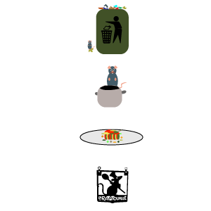 What I learned from this activity was that you can make simple things to explain or show something like here I'm using four icons to show the movie ratatouille because that was the only movie that I could still memorize. This activity helped me improve my skills because it showed me how to demonstrate things with simple icons.
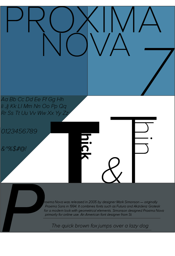 What I learned about this font was that this font was released in 2005, Proxima Nova was created by Mark Simonson in 2005, it bridges the gap between typefaces like Futura and Akzidenz Grotesk. The goal was to have a geometric look but with the warmth and approachability of humanist sans serifs. So, it's got this neat mix of styles that makes it super versatile for both print and digital media. It's super popular 'cause it's like a chameleon—it fits in almost anywhere, Also
Proxima Nova is widely used in various applications, both in print and digital media, It's a popular choice for branding and logo design because of its clean and modern aesthetic, You'll often see it in websites, mobile apps, and user interfaces, as it offers excellent readability on screens, It's also commonly used in editorial design, such as magazines and newspapers, thanks to its versatility and legibility. So, whether it's for a website, app, or publication, Proxima Nova is a go-to font for many designers and that is one reason on why I decided to choose this font, I would use this font in documents, and other stuff because of it clean design.  The first time that I used Illustrator was pretty simple, But in this project was even more simple because we just used shapes, Some things that was different with Illustrator was that you can work outside of the artboard and some similarities were that there was also layers on Illustrator, what I liked about Illustrator is that you can create your own designs or art, where I see myself using it in the future is using Illustrator to create art or posters.
|
